

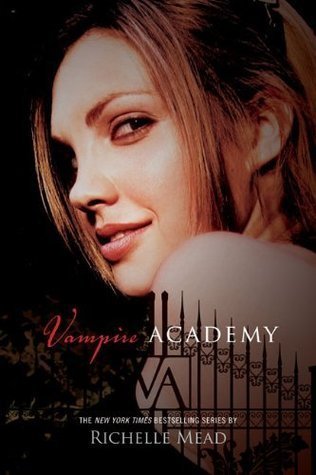
Vampire Academy by Richelle Mead. I'm just not a fan of books with actual people on the cover, and this girl looks way too much like Angelina Jolie.

Cryer's Cross by Lisa McMann. This is the paperback cover. The hardback cover is AWESOME and has this creepy etching in an old school desk. This one makes this book look like a romance...and it's not.

Choker by Elizabeth Woods. This cover is boooring.

Flygirl by Sherri L. Smith. This book was so good--a great historical fiction book about a girl wanting to join the WASP. But no one will pick it up in my library because of the cover. They just don't like the image of her and it definitely pushes guy readers away.

Pregnant Pause by Han Nolan. Again, another boring cover.

Ice by Sarah Durst. This looks like a girl is hopelessly in love with a polar bear. Yeah, I have no desire to pick it up now.


Shades of Earth by Beth Revis. I love this book series and I loved the design of the first book in the series (on the left)...and then the publishers changed the third book to this design theme (on the right). And I just want the first design back! Besides, who wants to have the trilogy with different themed covers?

Radiant Darkness by Emily Whitman. Again, another great book (this one is about Hades and Persephone) but this girl does nothing for me. And kids just don't check this book out.

Repossessed by A.M. Jenkins. Could be so much better without a cartoon.

The Beastly Arms by Patrick Jennings. I HATE the font of this title. It looks too much like the Harry Potter font, so I think of this book as a Harry Potter wannabe. Which I'm sure is not an accurate representation of the book!
So what covers do you wish you could re-design? Leave a comment below! And come back tomorrow for an outfit inspired by Between Shades of Gray!


There are some perfect terrible book covers on this list. I also hate the new Cryer's Cross cover. Why? Why?!
ReplyDeleteOh, I read Radiant Darkness ages ago---it was really good! But I agree, cover looks self-pubbed. And yeah, the new Cryer's Cross. Just bad.
ReplyDeleteIf they look like romance novels, I avoid them. I am shocked to learn that some covers make them seem like romances when they are not. Maybe they should redesign them so more people will pick them up.
ReplyDeleteI agree with all of your picks! So glad to find that it's not just me who thinks the VA girl looks like Angelina Jolie, looks like we all see it! My TTT.
ReplyDeleteI'm glad to see you all agree about Cryer's Cross! I agree, Tiffany--if it looks like a romance, I usually don't pick it up.
ReplyDelete